Colors evolve, and our collective fashion choices change. Different shades and hues of sometimes very similar colors can inspire vastly different emotions and ideas and elicit completely different thoughts and memories. But somehow, despite our varying life experiences, the human condition is such that we respond similarly to many colors. The 2020 Pantone Color of the Year was Classic Blue, chosen pre-pandemic and pre-Black Lives Matter protests, back when the world seemed more innocent and something that was “classic” and vaguely patriotic wouldn’t also seem . . . off, somehow. At least that’s what I thought at first. But then I looked into it further, investigating Pantone’s website and looking for other places it was referenced. Pantone cited Classic Blue’s “reassuring” qualities and the oft-mentioned reflective mood of blue hues. They say it offers refuge and fosters resilience, both qualities we can appreciate and even crave in a color, especially now. Blue symbolizes integrity, knowledge, power, and seriousness, but it also symbolizes despair and sadness, especially in the United States. People who’ve “got the blues” are down, probably in a clinical sense but possibly never officially diagnosed. The entire music genre of “the blues” is based on that feeling of general despair, but there is a certain artistic integrity to the thought of “having the blues” and blues music that isn’t really present on the surface of the idea of clinical depression. Many associate blue with the sea and with the sky, which both inspire reflection and lead the brain to journey uninhibited down thoughtful paths. And I don’t know about you, but when my brain goes uninhibited down thoughtful paths, I either end up in the dumps or in Crazytown. Interestingly, though, throughout recorded history, blue is more common in the idea of “true blue,” which is associated with honesty and, well, truth. This idea also harkens back to water, which is clear and also “washes” away dirt and debris, which reveals the true essence of a thing. I love color and sometimes just click around on the hex spectrum for funsies, which has never gotten me very far at work, but it has inspired me to document some of the beauties I’ve found and try to understand more about them. This post focuses on some of my favorite blues.
1. Sea Blue
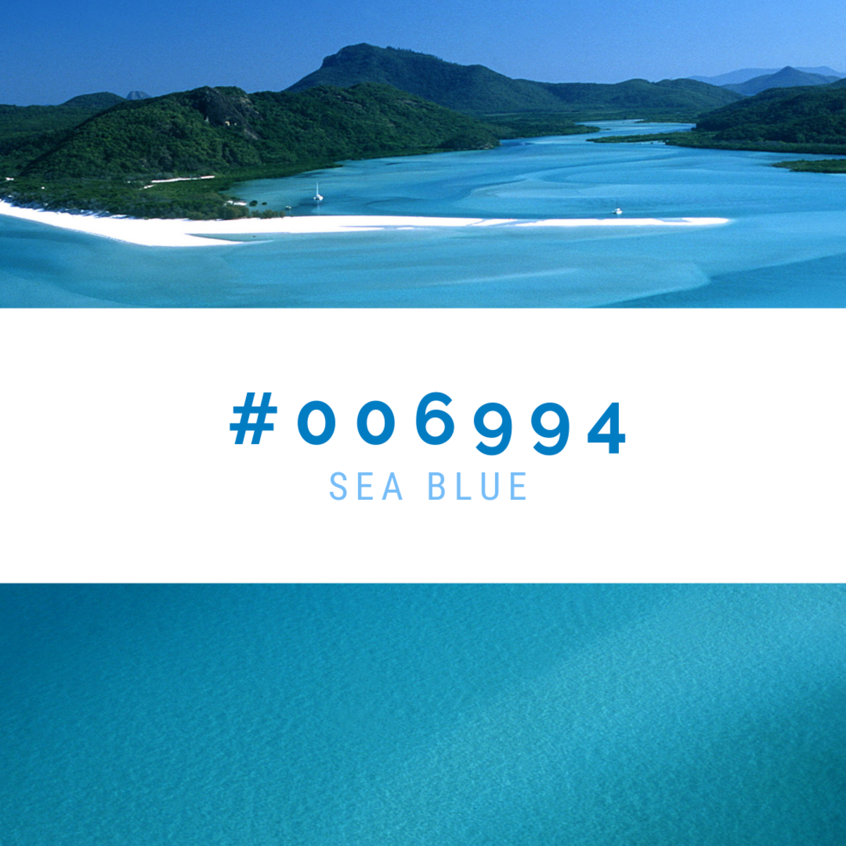
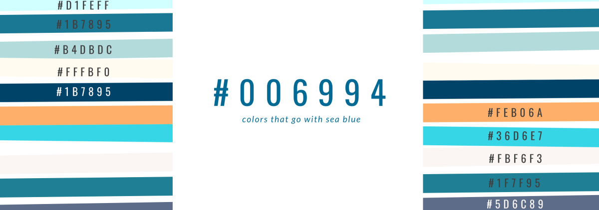
Not to be confused with ocean blue, which is lighter and more vibrant, the more mature body of water-inspired sea blue is a beautiful, moody blue that’s compatible with many colors. It’s technically called dark blue, but that’s boring and nondescriptive, so it’s generally known as sea blue, which is emotive and much more meaningful as a name. Pair sea blue (#006994) with tans and oranges to maintain the reflective, relaxing beach vibe. At 41.2% green and 58% blue, it’s a truer blue than many and is offset well by shades of navy that are dark enough not to blend in. It also works nicely with muted shades of rose pink, but you’ll need to ask google for those hex codes.
2. Cerulean
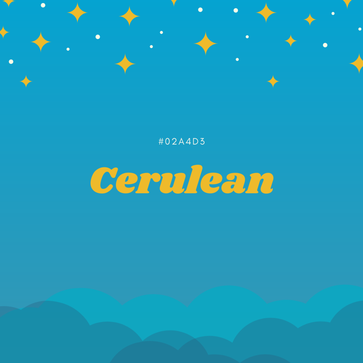
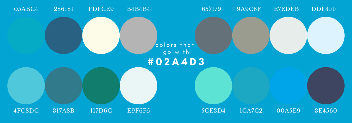
Cerulean is a beautiful and sought-after blue that emits supercharged natural energy with its unusual, vibrant tone. It was Pantone’s 1999 color of the millennium and has been a favorite in the Crayola 64-color crayon box since it was introduced in all its waxy glory in 1990. It also experienced a worldwide shortage in clothing and other textiles in early 2019 after a chemical factory explosion in China that killed 78 people and left over 200 injured. The explosion, chalked up largely to negligence, lack of regulation, and poor management, also destroyed a huge supply of a chemical used widely in the creation of dyes and pharmaceuticals. After its creation in 1805, cerulean pigment became available to artists in 1860 and became popular right away, finding its way into Monets, Manets, and more. It also found its way into Anne Hathaway’s Casual Corner bargain bin sweater in The Devil Wears Prada, being the source of rage for Meryl Streep’s character, Miranda, who goes on a factually incorrect but still wildly intimidating and entertaining rant about how she and her cronies are so fashion-aware that they, in fact, picked out the sweater for her, or something like that. Cerulean (#02A4D3) is 0.78% red, 64.31% green and 82.75% blue. Like sea blue, it goes with tans, but not as well with oranges. It also looks great with certain natural-toned greens and has the effect of being the featured color among other colors that look like they came from the earth.
3. Teal
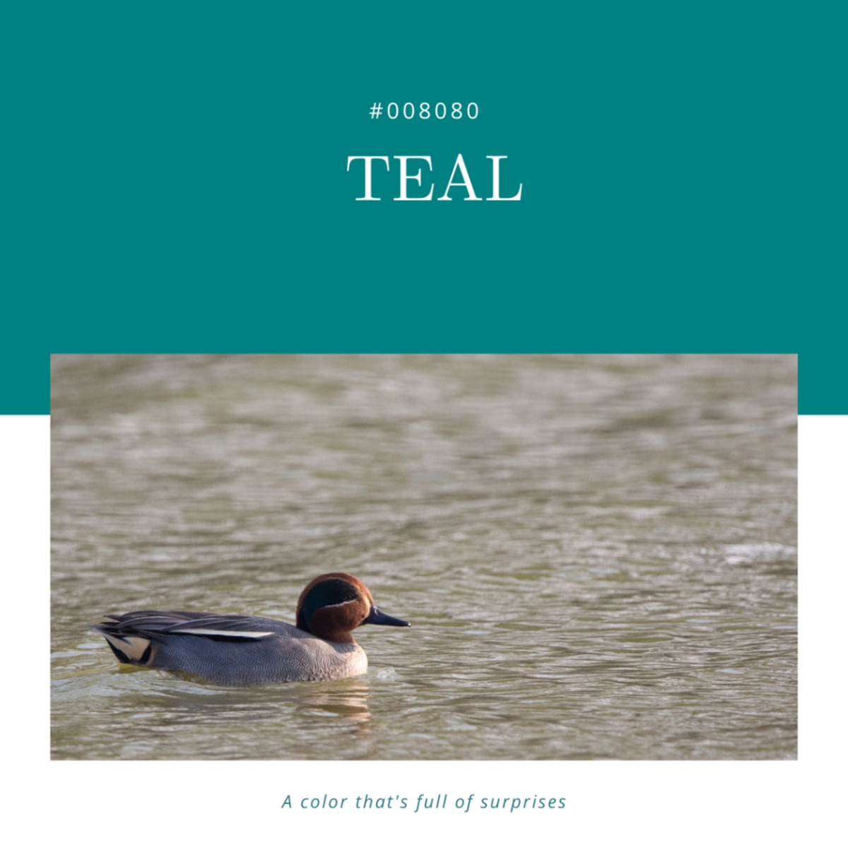
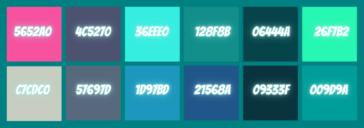
After being a feature of many 1980s sports teams’ jerseys and a staple on the geometric patterns of shiny, puffy winter coats made for adults and children alike, teal became a symbol of American consumerism and a bold color used to make a statement. “I’m pretty, gentle, and flattering on almost everyone, but somehow I’m still obnoxious,” is what it said. Perhaps because of its short-tongued name and slightly annoying pronunciation, teal proved polarizing in the fashion and design world but was embraced unapologetically by tween bedroom walls the world over. According to The Knot, teal is apparently making a resurgence alongside red, cobalt, and fuschia in 2021 wedding decor, colors alarmingly reminiscent of the abovementioned puffy ski jackets. But regardless of its cringiness, teal is an incredible color that works really well with a lot of palettes. Plus, Taylor Swift tweeted or ‘grammed about it at some point, as unapologetic about her love for it as we should all be. Teal gets its name from the unassuming little duck pictured above, the Eurasian teal, who has a shiny teal-colored swath on the side of his face (aka speculum) that inspired the creation of the color. Described by Wikipedia as “highly gregarious,” these little Eurasian teals dabble at the surface to eat and make a sound called a cryc, a scratchy, high-pitched honk-like thing that sounds cute from far away but grates the senses up close. Anyway, there are many types of teals, it seems, but the Eurasian birdy is the one who gets all the credit for the color. Whether or not teal (#008080) is an acceptably posh color for Seventh Avenue, it has quite a squad that works nicely with it. Because it’s 0% red, 50.2% green, and 50.2% blue, it enjoys the benefits of coordinating with the green spectrum and the blue spectrum. Here are some pretties that go along with the color we love to hate:
4. Dusty Blue
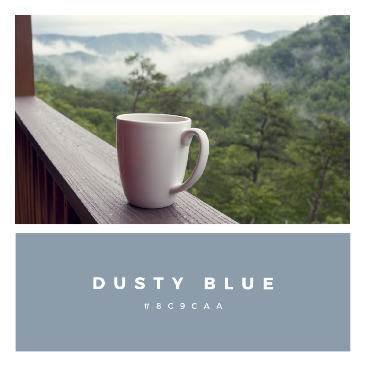
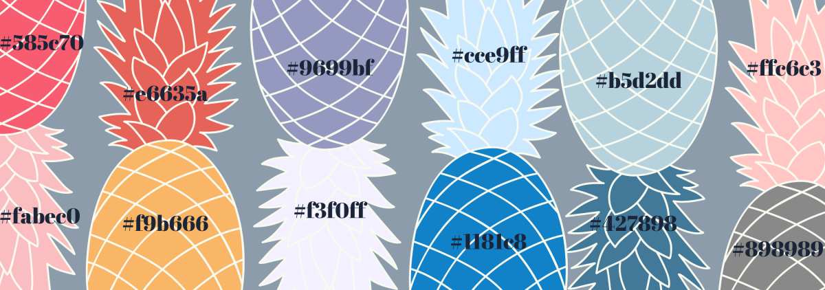
Dusty blue (#8c9caa) is almost grey. Okay, it’s grey. But according to the hexadecimal system and bridesmaids’ dresses collections across the internet, it’s blue—just the dusty kind. Also known as Botanical, it’s 54.9% red, 61.2% green, and 66.7% blue, and it goes with shades all over the color wheel because of its nondescript, lively quality. Yet another color that’s easy to wear, the almost metallic, weather-inspired mood it creates is good for adding emotion to an outfit, a design, or decor. The word “timeless” comes to mind when looking at this color, and in addition to white, black, and wine, it complements purples, other blues, oranges, pinks, and beyond. Hexadecimal colors are based on binary code, which is why computers can read them so effectively. They’re not like your paint mixer at Lowe’s, who take half an hour to promise they’ll never be able to make the same color again even though it’s a machine that makes it. The crazy numbers tell the computer how much red, how much green, and how much blue to include in the visual, and they allow for accuracy down to a tenth of a percent. Selecting the right one can be a challenge but a fun one to embrace. And color over the existence of humankind has inspired awe and discipline, but it’s something that can be learned, like this guy says: But as soon as you think you know what a certain color means to you, it changes, or you change, and you can never put your finger on it. So maybe it’s better to continue to feel it out and to always follow an easier, more beautiful philosophy to guide your choices: —Eugene Delacroix —Paul Delvaux
